
The Client:
MoodPanda
What does the app do?
- Track your moods
- Get detailed insights into your moods and feelings
- Connect with other people
- Share problems and make friends
Who is the app for?
- For people who wish to track their moods
- People who are suffering from depression or a mental illness
- People who would like to connect with others going through similar experiences
Problem
The MoodPanda app has a lot of users, but the app needed updating. The overall design and functionality of the app is very overwhelming, busy and confusing. There is a lack of communication around privacy on the app.
The client wanted to promote a healthy mindset, and give the users a positive experience from the outset. To create a space where the user felt comfortable in opening up to other users, and to get more insight into the reasons behind their moods.
This case study was for a final project for IADT Interaction Design principles course.
Roles
- UX researcher
- Interaction designer
- Visual designer
- Branding designer
- UI Designer
Before

Competitive Analysis
I first conducted a competitive analysis of existing mood tracking apps and games on various platforms.
- Smiling Mind
- Daylio
- Mood Diary
- Breeze
The main take-aways from the competitive analysis include:
- Most had a clean and clear design
- More capacity to add more details and create greater insights into causes of moods
- Up to date with industry standards
- Some of the visual designs of these apps tended towards a feminine look, which I noted to stay away from as not to alienate anyone from using the app.
- No community aspect to the apps
Personas


As-is Scenario
- They sign up for the app, log their first mood update and fill in the comment box. The home screen is busy and crowded.
- They have a notification that someone they do not know is virtually 'hugging' them. They find this a bit overwhelming and invasive.
- They look to change their privacy settings but they are having difficulty locating them.
- The homepage is full of random people's updates. It's really overwhelming so they log out.
- There is nowhere to put the emotions that they are feeling or why they are feeling this way.
Design Goals
Based on the user needs and the gaps in existing products I summarized the higher level goals I hoped to achieve with the redesign.
User Goal
- To track their moods over time and get a better understanding as to what is causing them.
- To have a better control over the privacy settings in the app.
- To connect with others who might be going through something similar.
- To not get overwhelmed by the structure and design of the app.
Design Implications
- Allow the user to enter more details when updating their mood to get better insights over a period of time.
- Give the user privacy control in each mood update.
- Invite the user to connect to others by creating a social activity feed.
- Use a minimalist and calming design to create a sense of ease while using the app.
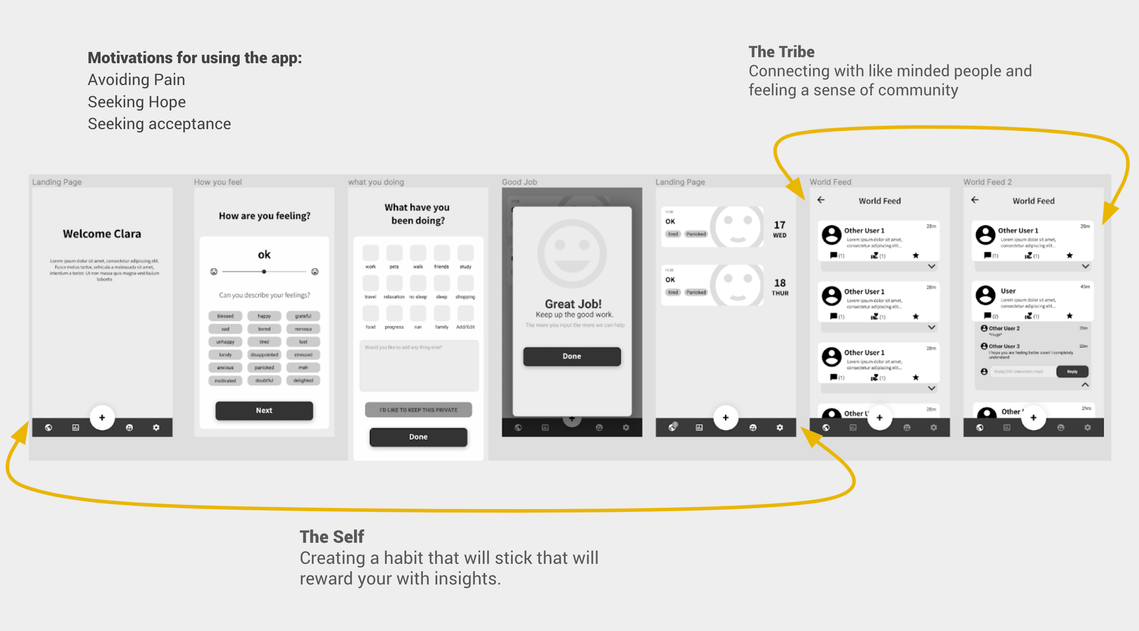
To Be Scenario

Sketch Wireframes

Lo-fi Wireframes


User Testing
With the prototypes produced, the project did not have a budget for user testing. I still managed to send it out to some potential users and ask them to try it out. Not expecting a full user test, I asked simply for some feedback.
The feedback I received was:
- The icons on the bottom navigation where too small
- It was sometimes unclear what the icons symbolized.
- The onboarding was a little too long.
- Bubble Graphs were confusing, it was hard to remember which colour correlated to which mood.
- The percentages on the bubble graphs where nice but again it was hard to really understand the colours and remember them.
- For accessibility, the colours on the bubble graphs would be too hard to distinguish from each other.
Side by side Comparison


Reflection
I am quite happy with the end result of my app redesign. I was able to implement good design practices and to create a visual design that was calming and inviting. I believe that bringing the privacy settings to the onboarding section of the app and later on giving the choice to change those settings while updating their mood, would instill a sense of trust in the app. It could also lead to the user feeling comfortable sharing their mood updates in future.
Given more time there are many aspects of the design that I would have liked to explore further. For instance, to delve into the community side of the app, expanding it to create a place where people would feel very comfortable connecting and sharing with each other. I would have also explored gamification in the app. It seems to me that there is a lot to be said about implementing gamification in creating habits. Users can find it hard to remember to constantly track moods, food, medication etc in tracking apps and getting a ‘badge’, ‘achievement’ or a reminder notification is not always enough to hook them. For this reason I would have explored options for real-world rewards, possibly involving internal currency. Creating better graphs and insights was also something that I felt needed to be done, as a lot of users would want a better understanding of what is causing their moods. Better insights would be key to creating that self-realisation that could bring the user back time after time.
All projects